
Book covers.

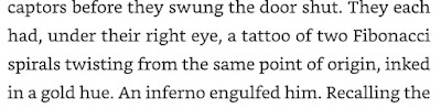
There's a formatting error (which undid some corrections) and two links that need updating in my book. So I'm fixing that this month. And while I'm at it, I considered creating a new cover. The problem is that I like my current cover. The cover is perfectly explained in Chapter 3.14 𝛑, and again later in the book. You can see (with only minor imagination) earth, air, water, fire, flora, and fauna on the cover. It goes with the book. And it shows what two Fibonacci spirals twisting from the same point of origin, inked in a gold hue, looks like.
Unfortunately, one has to read the book to understand that the cover is perfect. So the cover isn't selling the book, which is also a job of a cover.
I'm never going to put images of people on the cover because that kills the reader's chance to picture the characters as described. But what are others in my genre doing? Here's a look from Amazon:
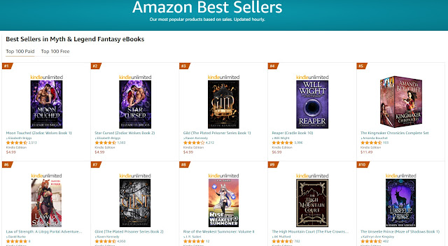
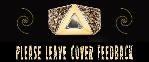
Numbers 3, 4, and 7 could maybe work as inspiration. I could keep the two Fibonacci spirals twisting from the same point of origin, inked in a gold hue. And perhaps create an image of Xavier's ring. Perhaps if I blended in number 9.
Numbers 3, 5, and 6 (all the same book) remind me a lot of the cover I have.
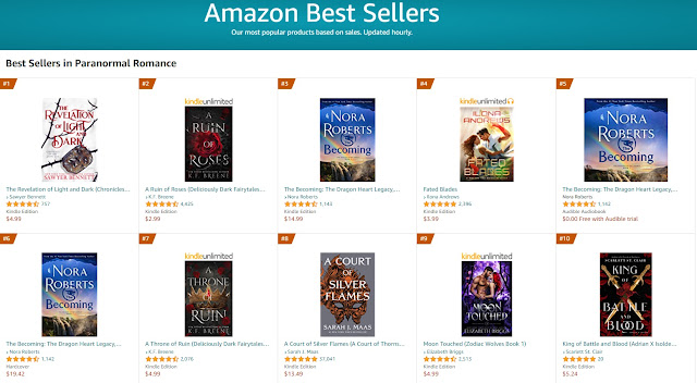
2, 7, 8, and 10 again make me think I should use Xavier's ring.
2, 7, 8, and 10 again make me think I should use Xavier's ring.
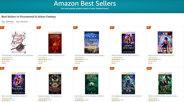
Again, I feel like 3 looks like what I have now. I'm not sure I could make 1 work.
But how about this:
1- What I currently have.
2- A blend of what I have and something new.
3- Something new. (A bit like 3 and 9 from the Myth & Legend category seen above.)
But how about this:
1- What I currently have.
2- A blend of what I have and something new.
3- Something new. (A bit like 3 and 9 from the Myth & Legend category seen above.)


BASED ON THE AVAILABLE EVIDENCE OF WHAT SORT OF COVER ART IS ON THE CURRENT BEST-SELLERS OF MY BOOK'S GENRE--
WHICH OF THESE THREE COVERS DO YOU LIKE THE MOST?
IWSG

Shout-out to Alex and the awesome co-hosts for today:
PJ Colando, Diane Burton, Louise – Fundy Blue, Natalie Aguirre, and Jacqui Murray!
Dec 1 question - In your writing, what stresses you the most? What delights you?
Answer: As I'm working on Book Two and Three...
I finally figured out what I didn't like about a few scenes. A stronger reaction to certain events was needed. So I was stressed because I couldn't figure out what I needed to fix.
In a way, what stresses me about this book and the next is that I have to torture my favorite character. But then I get to give him what he wants most (he doesn't even know he wants it yet). And then I'm going to take it away again. (And some character gets punched in the face so freaking hard when it's revealed that it's going to be taken away... 😈😄 ) And then the character has to start from scratch to get what he wants back, this time knowing that he absolutely has to have it.
What delights me are inside jokes. I have slipped SO FREAKING MANY tiny jokes in these books. It's just a line here and a line there. Some that no one could catch on the first read. Some that can't be figured out until the slowpoke writer gets the other books published. (Damn him... oh wait, that's me...)
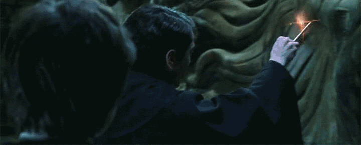
And if you happen to keep on scrolling, you'll see the sense of humor to which I'm referring. In case you don't "get" it, here's a visual clue of what I did, though mine is much simpler.
Please also visit: The Insecure Writer's Support Group Book Club
This month's reads are Falling for the Villain by Kim Elliott and Being Human by Patricia Lynne
 Happening at OperationAwesome6.blogspot.com
Next week at Operation Awesome, we're sharing posts all week about getting ideas for writing. Stop by, maybe pick up a spark!

https://writeeditpublishnow.blogspot.com/2021/12/wep-2021-continues-artistic-inspiration.html
This month's reads are Falling for the Villain by Kim Elliott and Being Human by Patricia Lynne
Happening at OperationAwesome6.blogspot.comNext week at Operation Awesome, we're sharing posts all week about getting ideas for writing. Stop by, maybe pick up a spark!
WEP
https://writeeditpublishnow.blogspot.com/2021/12/wep-2021-continues-artistic-inspiration.html
#BeautifulPrincess👸 🧛♂️ Parable
— J Lenni Dorner
Once upon a time…
There lived a beautiful princess. It's very important that you know she was beautiful. In fact, if you look in any of the history books, her beauty is the only detail you'll find about her. It was ordered as such. No mention of her political stances, if she read or wrote poetry, how well she could ice-skate, or her preference of cake. No, the only words recorded about her anywhere of note simply state that she was a beautiful princess.
Being a princess, she was obligated to eventually marry someone suitable. A prince came to ask for her hand. His kingdom was very wealthy. His father had ruled for a long time, and the prince was a rather old man. The princess sent him away.
A duke came from another land. He was well-decorated from winning many battles. His strength and skill were a legend across the conquered world. The princess thought he would be worthy, until he entered the great hall. A bright red scar cut across his freckled face. She screamed her rejection as she fled to her quarters.
There was an earl she had known for years. The beautiful princess went for a visit. The earl was especially fertile, as evidenced by his many pregnant wives and gaggle of offspring. He offered to marry her into his harem. While she respected the poly lifestyle, she didn't feel it was a match for her. She politely declined and left for home.
Count Alucard heard of the princess and her suitor search. He sent a trusted advisor to discover what she wanted in a husband. Armed with knowledge and an invitation, he came to call one evening.
"Look upon me, Princess. I am the embodiment of youth. I have won battles, yet remain unscarred. I have no other wives, nor children from another to compete for your throne or power."
And so the beautiful princess agreed to marry the handsome count. They had a quiet ceremony under the full moon. All seemed well at first.
The princess soon noticed she was weak and cold all the time. The doctor told her to eat more red meat and beans. It made no difference. She was wilting away.
Her husband carried her to his chambers one evening. He pulled a sheet off a large box. The princess's eyes went wide.
"Why do you have a coffin in your chambers?"
"I made it." He pulled the lid open. "See inside? There is a portrait of you, along with a mirror. Ah, you can already see how your looks are fading away!"
She pressed her hand to her mouth.
"To thank you for the nourishment you've been providing during your induced slumbers, I have added this small hole. It will allow air and a tiny ray of light. Do enjoy the view."
He swung at her, breaking her jaw with ease. Once she was bound and muffled, he forced her into the coffin and sealed it.
The beautiful princess died a slow and painful death, forced to watch her beauty fade as she went. She pictured the name of the Count she married as she looked at the mirror. It was obvious to her now.
Count Alucard, now a king, ruled for many years. The population of the kingdom dwindled. Eventually, he took a new name and another bride who valued beauty and youth above all other qualities. They did, in his opinion, taste the best.
Tagline: A simple story with a lesson about valuing youth and beauty above all else. 🧛
FCA 577
#BeautifulPrincess👸 🧛♂️ Parable
By: J Lenni Dorner
3 is hard to read without zooming in. Is it bad that I like the font in the reminder image at the end the most??? Also, does the ring look like it could be a crown to anyone else? Maybe a bigger spiral thing?
ReplyDelete🧛♂️ I know the vampire! Sneaky sneaky, yo!
😏
DeleteWhat's wrong with a character getting punched really hard in the face?
ReplyDeleteI have to say your original cover is best as the text is hard to read on the other two. And look at the Nora Roberts book - similar idea and obviously it's selling.
The character knows the punch is coming.
DeleteI wonder if Nora's sells more because of the cover or because of her fandom?
I agree with Alex. I really like your first cover best. The other two don't excite me and are hard to read. Good luck figuring it out.
ReplyDeleteThanks to weighing in.
DeleteHi J,
ReplyDeleteA disturbing end to a narcissistic beauty. It is sad when people put so much into their looks and have no interior substance. A lesson to be learned for sure...
I actually like the third cover best. BUT, as stated, it is hard to read. What I would do is LIGHTEN the text color. Perhaps use the silver like in the second one. That would make the title POP and it would be easier to read.
Thanks for the feedback.
DeleteI like the original cover. And like you I don't like people on the cover either. But, it seems, readers do!
ReplyDeleteLoved the parable. But do tell what becomes of the handsome prince? Karma, I hope! :)
🤔 I'm pretty sure what happens to him is Harker cuts is head off while Morris stabs him in the heart. 😉
DeleteLOVE the final line - great story!! Love the Alucard twist too :)
ReplyDeleteFor the covers. #3 is too difficult to read.
I prefer #1 your original, but I wonder if you could punch it up with more colour - maybe a brighter photo?? The others you've shown jump out while your cover is quieter.
I don't know if all genres are the same, but in the romance category, there is sometimes a big difference between indie covers and trad pub covers. Good luck!
🖐 High five for getting the twist!
DeleteThanks for the feedback.
Ouch.
ReplyDeleteI wonder what Count Alucard's fatal flaw is? And hope he has one.
There's a big debate on the Internet about that.
DeleteWell, your character was surprised by her husband. Such a waste. As for the cover, I like the first one.
ReplyDeleteNancy
Thanks!
DeleteHi J Lenni. I like the second cover best, but you must highlight your author name and maybe a different font for the title so it can be read easier. I think the original is too wishy washy and three, don't like it at all. But all that is subjective. All we can do is check out what's selling - cover first, blurb second.
ReplyDeleteLove your princess parable. Sad. No Narcissis/Narcissa ends well it seems.
Thanks for your feedback.
DeleteI prefer the first cover. It looks "clean" and to the point. The other two are too ornate for my taste and somewhat hard to read.
ReplyDeleteWell, it seems the princess was NOT rewarded for her narcissism. ☺ And, I love the play on words with Alucard!
Figured out who he is, hmm? Nice.
DeleteThanks for the feedback.
Hi J. Cover #2 with #3's series colour/highlight effect (it stands out more) and your name bigger on the cover to be read (and recognised) easier. But... Look at what they did with Zodiac Academy (#7 in Urban Fantasy on your screenshot): big image, tiny nod to subgenre inside image (bully academy romance) big series title, smaller book title beneath, author names readable. I also know that it is indie and on my TBR -- because of the covers and blurbs. Actually, with the elemental fae stuff in this series, I think it can be added to my list of comp titles! Good luck with figuring out the cover stuff!
ReplyDeleteThere's no fae in my book. Not actually.
DeleteBut yeah, I don't know, still debating changing things.
Xavier's ring was the object in book one that felt the most cover worthy.
That was a surprise. I didn't see it coming at all. Good job!
ReplyDeleteAs to the covers, I'd go with #1. It's clear and easy to read. The others are too dark and difficult to read.
Thanks for the feedback.
DeleteI liked the first book cover for its clarity.
ReplyDeleteI liked the parable, too. Giving too much importance to looks alone isn't taking you anywhere except deep down an abyss of self-destruction.
Thank you!
DeleteHi JL - I prefer #2 like Denise ... but it's your book - so all the best with your choice.
ReplyDeleteThe take on the prompt - a fairy tale with a gruesome take. All the best - Hilary
Thanks
DeleteHer narcissism was her undoing. Seems a common theme in this round. Nicely done.
ReplyDeleteI have to say I prefer the original cover. Some of the text on the others is hard to read and the black background does nothing for me. While it's true that you would have to read the book to understand the cover, at the same time the cover intrigues and makes you want to read - so it does its job.
Thanks so much.
DeleteI would select cover #1 of the three on offer.
ReplyDeleteAbout your WEP story: that silly princess got what she deserved. But the moral of the story seems tragic: the vampire count prospers. Maybe because he always chooses silly wives for his growing collection.
True. 🤔 That character isn't well known for picking excellent wives.
DeleteI would say #2. On #3 the title is almost impossible to read, especially at thumbnail size (and covers are all about the thumbnails, alas).
ReplyDeleteNice story. Obsession with looks seldom ends well. Though often it’s for the people around the vain one that it’s really bad.
And just to clarify, the main issue with cover #1 is that the photo of the coastline doesn’t feel like the genres you list, and the finonacci spirals aren’t enough to make it clear. In fact, I had no idea what genre it would be without your explanations. The second one feels like a good fit with other YA paranormal/fantasy sorts of things.
DeleteThanks for the feedback.
DeleteAlucard and mirror images...clever! He'll get his eventually, right through the heart.
ReplyDeleteI like your original cover best. On that one, I immediately recognize the Fibonacci spiral, but the smaller, separate versions don't read that way on the newer covers. Good luck on figuring out your cover.
Thank you.
DeleteI like the original best, honestly. I don't even know what the story is about, but it's pretty. The title is also alluring.
ReplyDeleteExcellent. Thanks.
DeleteThis is a brilliant take on the prompt. I like how the mirror in her coffin at the end revealed the truth of the situation. A perfect ending!
ReplyDeleteThank you.
DeleteI like your original cover but I think it doesn't go with your genre. Number 2 for me.
ReplyDeleteNow, to your chilling story. I loved the humour of the beginning where you point out that it was only her beauty that is mentioned and none of the other details that make up a person. The story took a dark turn after she married, I wasn't expecting that at all. It was a fun read.
Thanks.
DeleteI prefer the original cover.
ReplyDeleteGreat parable about placing too much emphasis on physical appearances, which Count Alucard used to his advantage to perpetuate a never-ending cycle.
Clever and fun story!
Thank you.
DeleteGreat parable - and I liked what you did with Count Alucard too! :)
ReplyDeleteRe the covers - I don't like characters on the cover either, speaking as a reader. I liked cover 1 best for its simplicity and clarity. The second is too dark, too plain, and the third is impossible for me to read. However, the font in 1 does feel too simple, please consider a more elaborate font - maybe the visual of 1 with the font of 2? All the very best!
Hmm... that is an interesting idea.
DeleteI agree with others. The third cover is hard to read. Loved the vampire twist in the end.
ReplyDeleteThank you.
DeleteCount Alucard--very clever! I didn't pick up on in until you revealed it.
ReplyDeleteHappy holidays if you celebrate them.