
Earlier this month, I asked for votes and thoughts on updating my book cover.
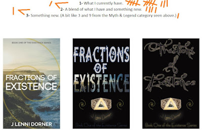
The original cover has 13 votes.
The second cover has 4 votes.
The third cover has 1 vote.
A mix of covers one and two, and a mix of covers two and three, each also got 1 vote.

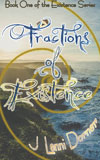
And here's a look at what one mixed with three would look like.
The font has more of a "fantasy" feel. I do love how the f in "of" matches the spiral.
It does feel more difficult to read at a smaller size. And my name gets a bit lost. It feels too "busy" to me in comparison with the original. A real problem is that "existence" is a long word at 9 letters. (And it's in the title of EVERY book in the series.)
The swoops and swirls of the font should make it look more like a book in the genres:
Speculative Fiction. Urban Fantasy. Paranormal Romance. Myths & Legends.
But should I make this change? The original cover did get the most votes!
UPDATE

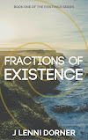
Dec 31-- Gave it one more shot. Thoughts?
I think it's very difficult to read. Maybe a different font?
ReplyDeleteI think I'd stay with the original cover. I agree with Alex that the fancy font makes it harder to read. The original, in my opinion, looks more professional. Ultimately, it's your book, and you have to decide what you like best.
ReplyDeleteWishing you all the best in 2022!
The mix of cover one with three is too busy. Fancy font on top of an image is too much.
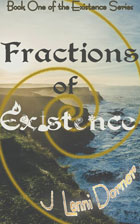
ReplyDeleteI wasn't around for voting, but I personally love the font on #2 on top of a black background.
Have you considered doing a cover with just that font and your name on it (removing the two spirals and the graphic below the title)? A popular look is to have the title take up the entire space of the cover, and with that font from #2 being as artistic as it is, it's really all you need.
If you don't want to lose the spirals or the graphic entirely, you could add them to the title page on the inside of the book. :)
Best of luck with the cover!
Happy New Year!
P.S. Sorry it has taken me so long to return a visit.
I forgot to come back to see the outcome!
ReplyDeleteI like the font for Fractions. Existence is a little hard to read, but I like that it plays on the COEXIST stickers.